Mobile (iOS), Web platform
Rentee, Proptech
NDA

Apartment rental
application

Info
Clients
US
Users
US
Industry
Rentee
Proptech
Services
User Experience
User Interface
Development
Team
Product Designers
Product Manager
Developers
QAs
Before we begin ...

NDA protected

This project is under NDA. The Non-Disclosure Agreement is a contract that requires the signer (the creative) to keep confidential and not to share any information pertaining to a project with anyone else. I changed branding and name to keep this agreement.
Project Overview [Mobile]

About

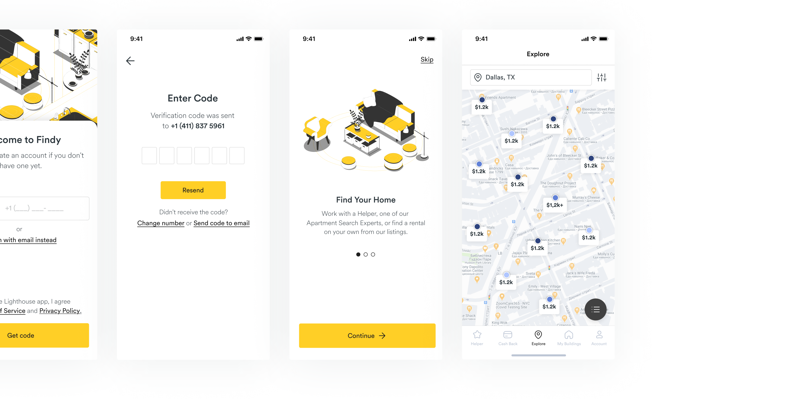
Findy is web and mobile apps for leasing apartments for a long period of time, whose vision is to make this process simple and pleasant. Findy connects property suppliers and homeowners with people from around the USA. To make this process more enjoyable, Findy have created a distinctive feature. Users get cashback during renting.

Task for mobile app

Availability on different devices has a major effect on business, and in this case, the client asked to create mobile app, change navigation logic and attract new users.

Problem

Our target audience faces the following issues:
  • No mobile application for the users (almost whole target audience use mobile phones during using the app)
  • Existing backend realisation that limits all process
  • Complicated navigation on web
  • Bad UX of web app
  • Low income of the company
  • Wrong customer's expectations and product strategy
Development

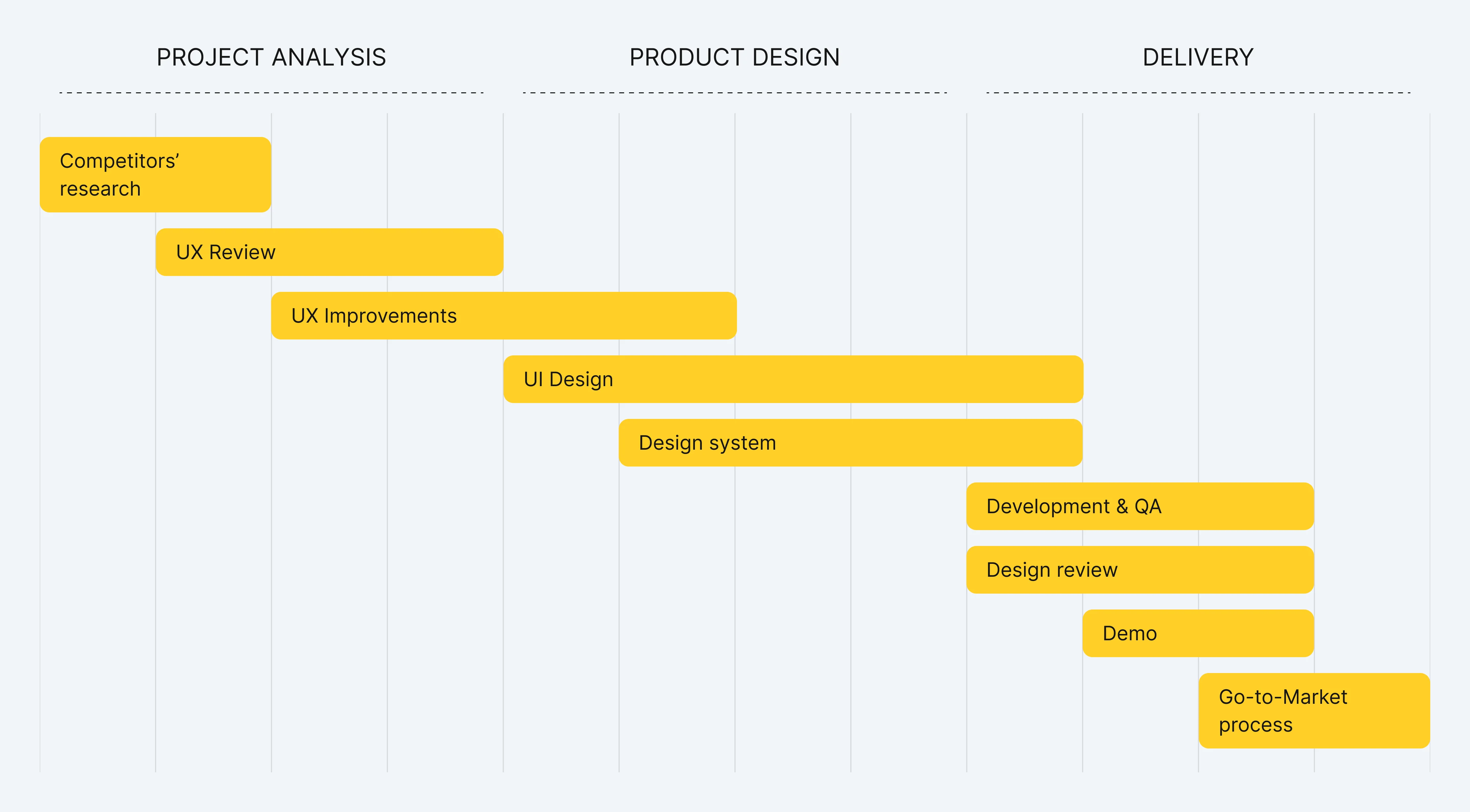
Development stages

Product development process was divided into several stages. Each of it had it’s own parts. Some of them I described below.

Project Analysis

Goal: analyse existing app, conduct competitors’ research, highlight blind spots, choose product growth direction.
Project Analysis

Competitors’ research

First of all, I checked all direct and indirect competitors to collect all habitual user-friendly solutions of popular apps (Airbnb, Booking and etc.). It helped to highlight blind spots of client app. I used this research on all next development stages.

Navigation

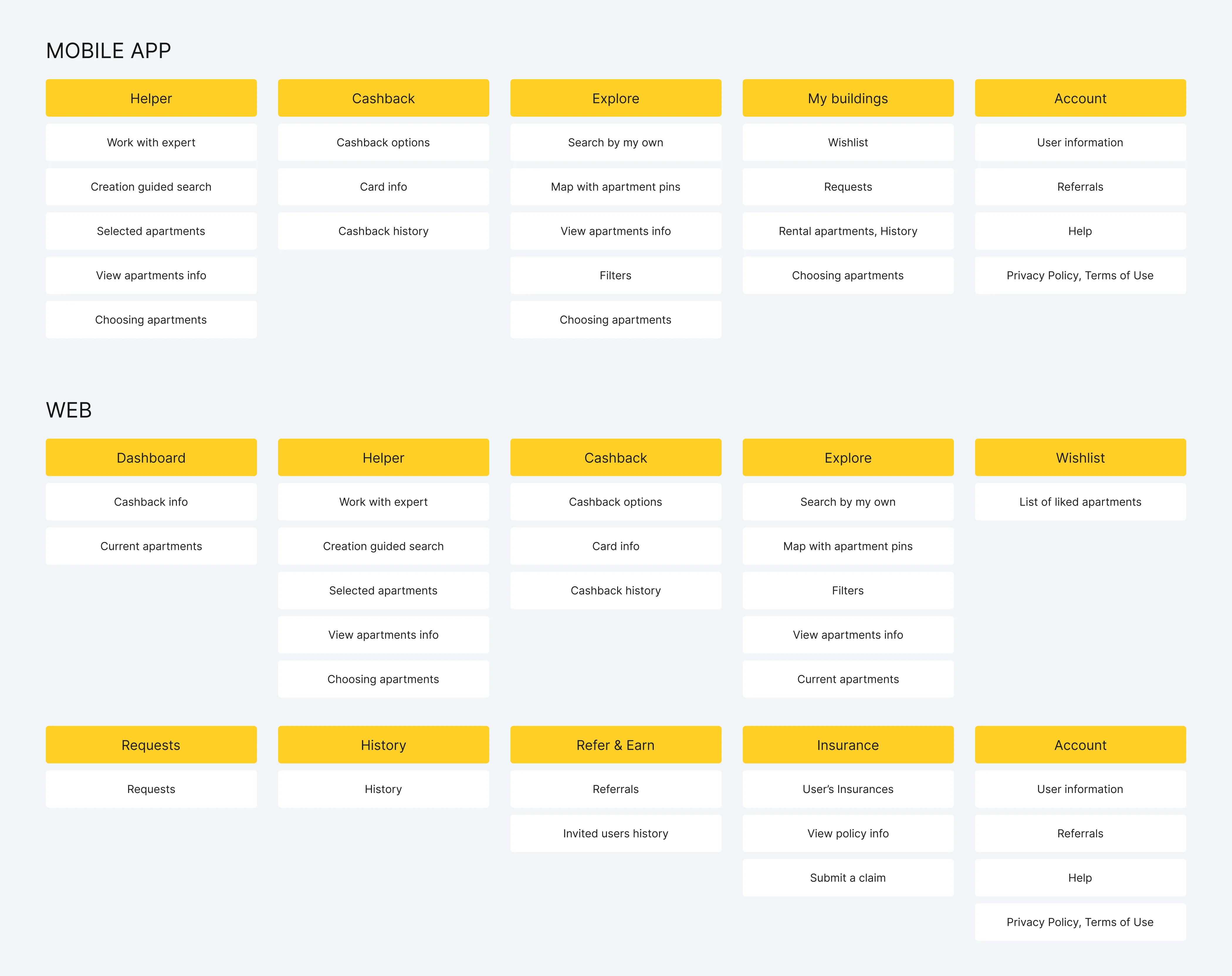
After competitors' research and existing app analysis I found out troubles with navigation. We suggested client some improvements on the website and new navigation adapted to mobile app. We provided some strong arguments and after discussions client approved our decision. Finally, we implemented it to web and mobile apps.
Some issues I faced

Backend limitations

One of the most important and complicated issues on the project was to create user-friendly interfaces with existing backend, working databases and without opportunity for developers to change some code parts.
Unfortunately, some of my suggestions were declined because of it. But I referred to such issues like amusing challenge: create useful apps in limited environment.

Process of approval

Findy is outsourcing project and I needed to discuss and approve design flows during whole process and before the dev team will start work. We faced troubles with process of approval all designs. Also clients asked to change flows in process of development that caused new estimation and double work.
After several meetings with clients we understood troubles and suggested some decisions how to improve process of collaboration. I presented my work by myself only on meetings. We suggested clients to choose who will make the end decision on approval. I made process of approval more clear and marked screens during call. Also we discussed issue with designs in development.

Problem

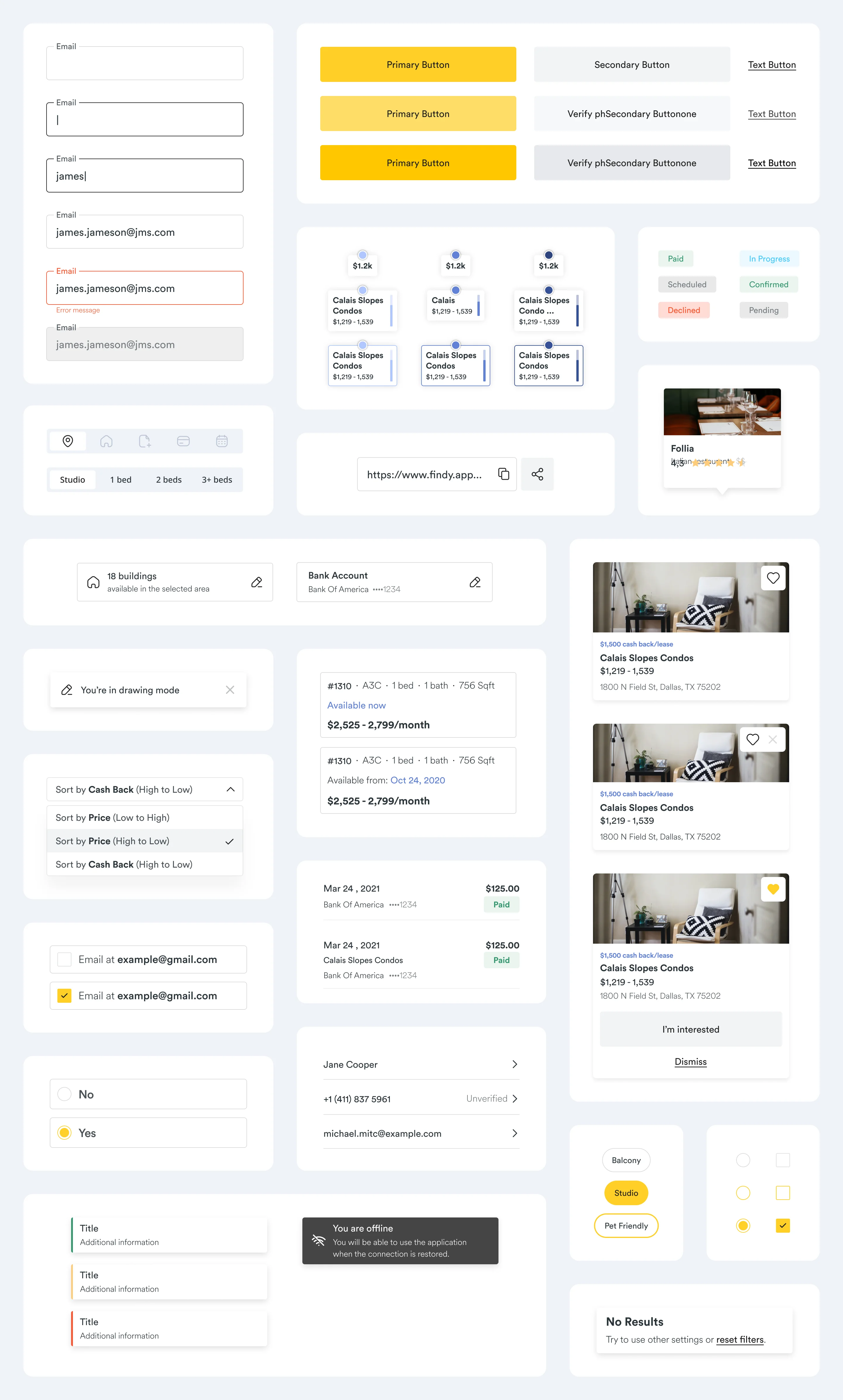
Findy is an existing web application. I needed to follow their brand guidelines. But design system of web version was in the process of creating and took several months based on estimation. What did I do? I started close collaboration with the designer from the client’s side. We had meetings several times a week, were in touch in messanger and I shared everything I had created to be sure that I got designer’s idea about future new brand and style. Some components are below.
Figma

Design System

All components of design system have states that illustrate behaviour of each element. Some are on the screen below.
Features

Filtering

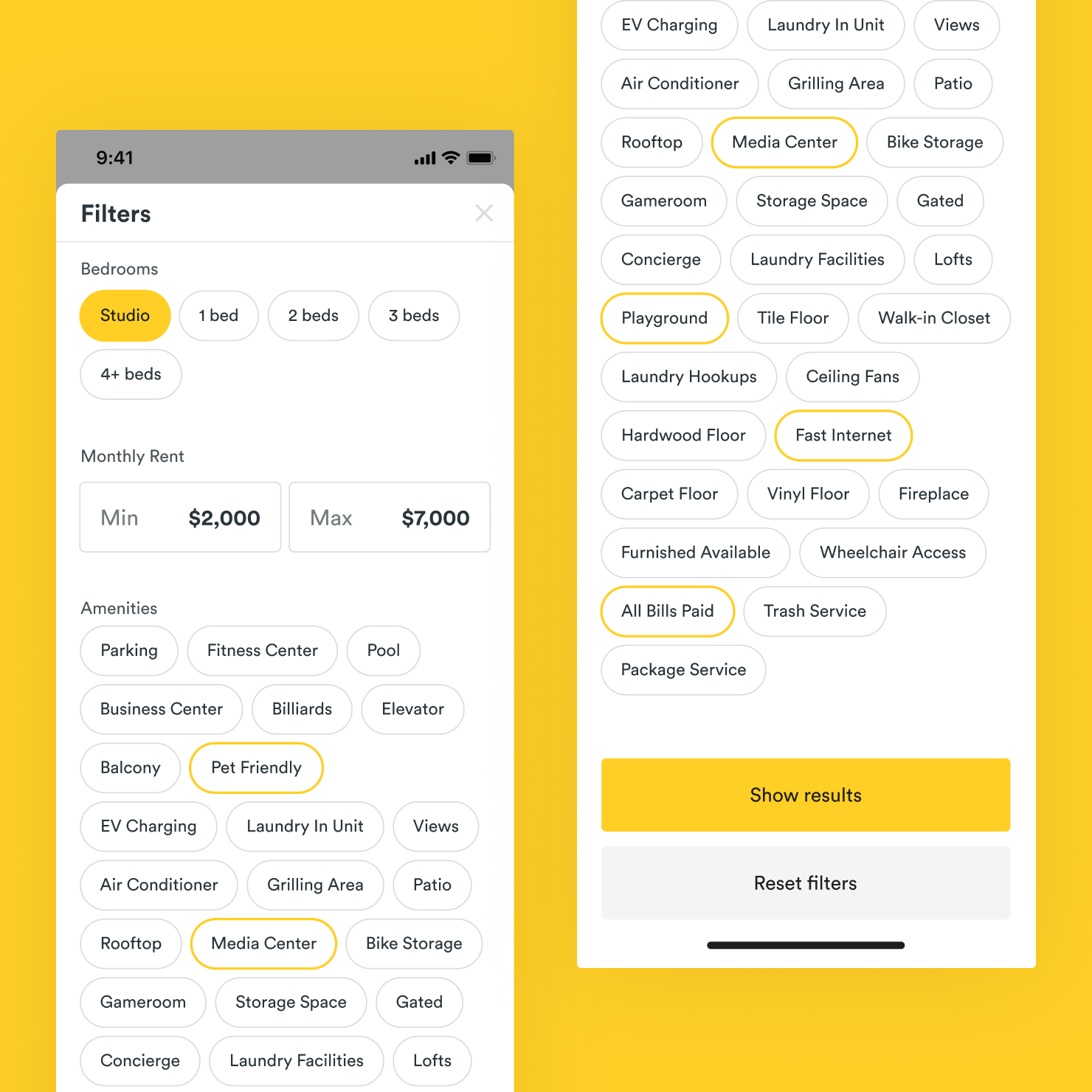
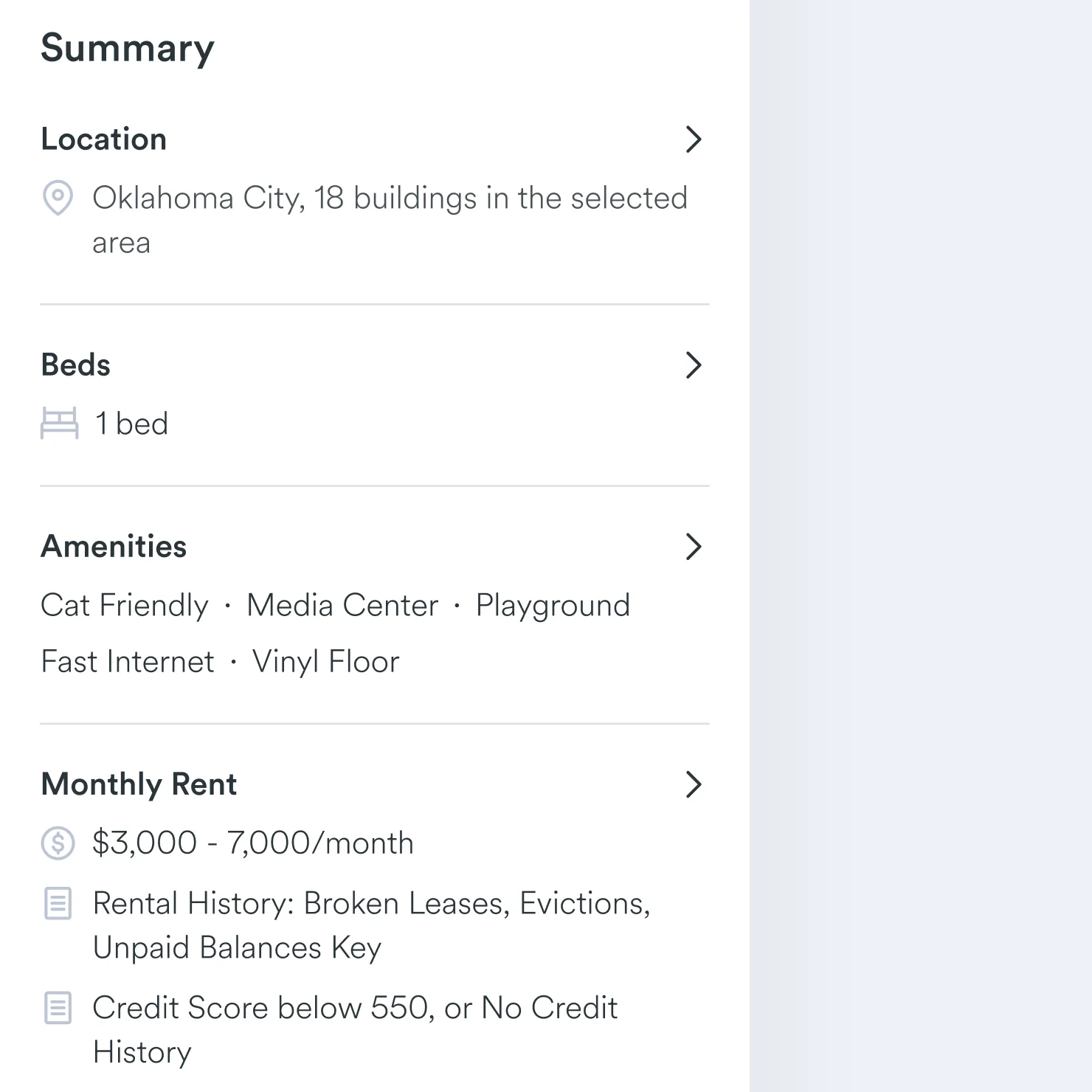
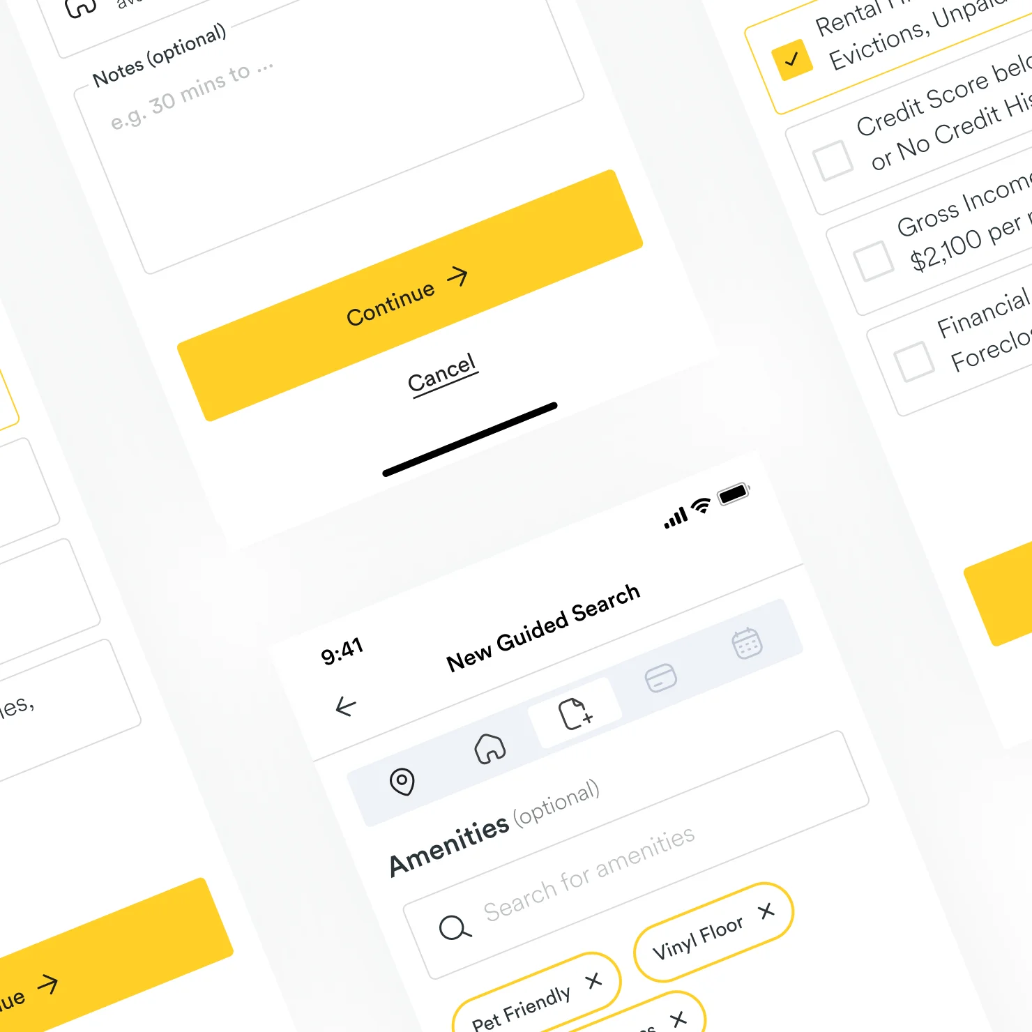
Improve search results with filters feature. Select all necessary requirements and save time looking for the ideal apartment. It’s possible to reset all filters with one button.

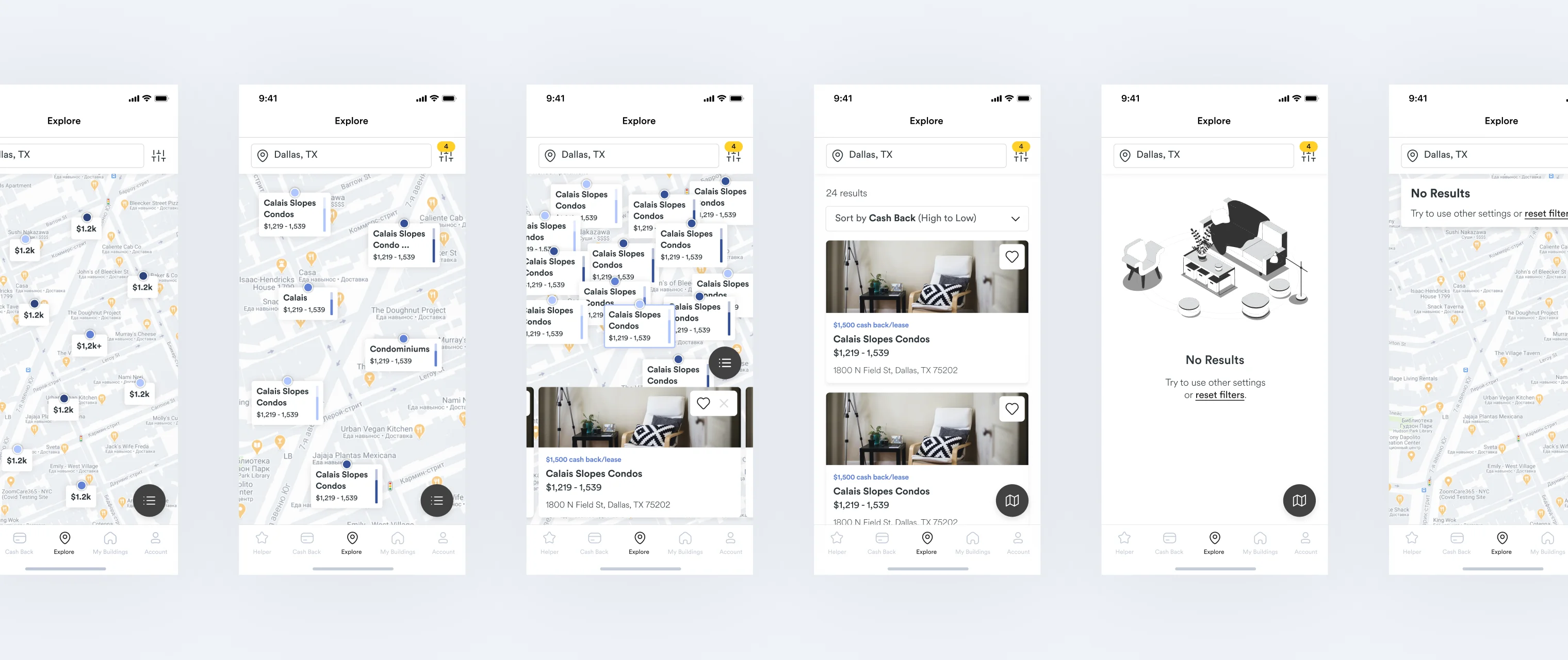
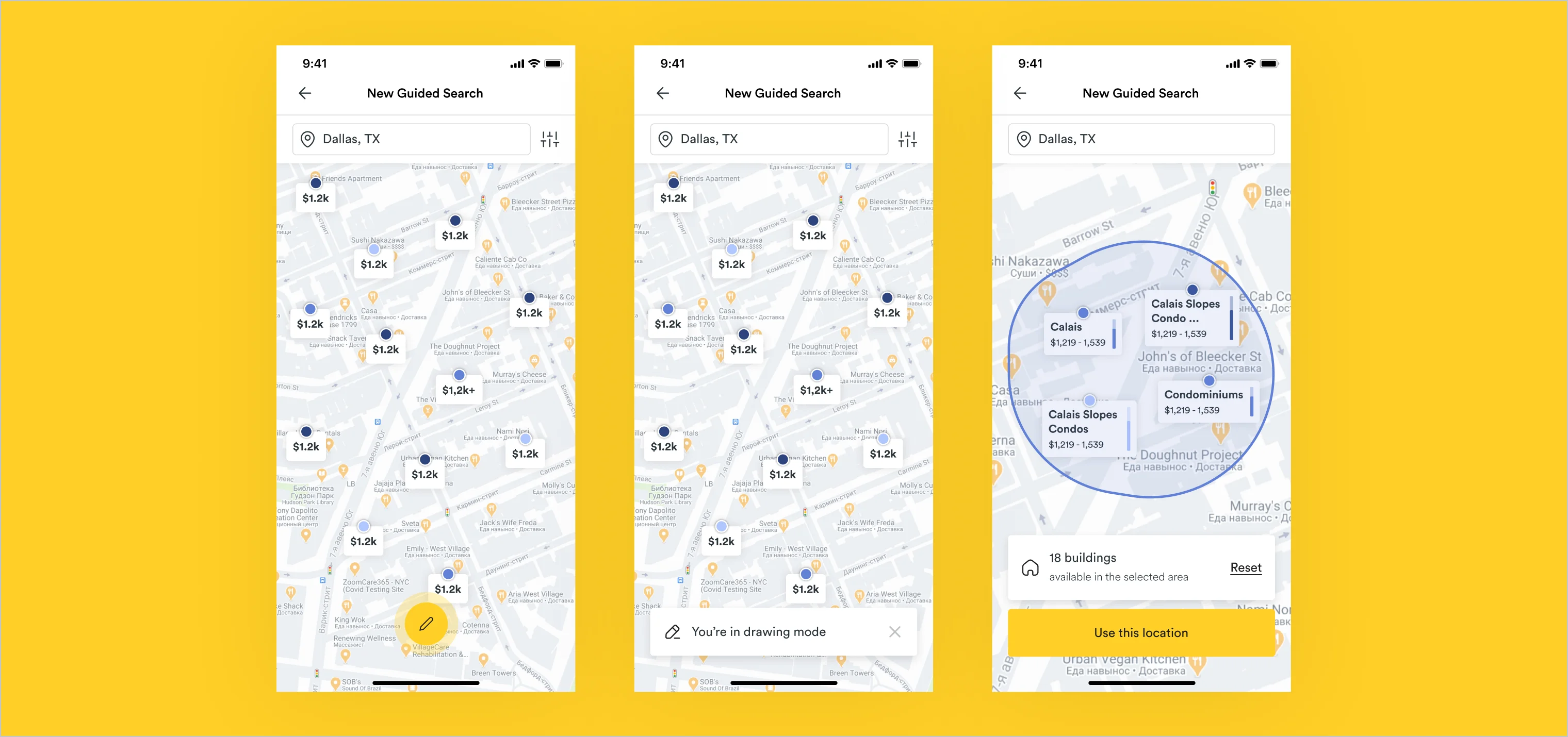
Interactive Map

All available apartments in one place. Users can zoom, choose apartments and check their details. Also, they can see all apartments in list view. No results? It’s possible to reset filters fast.

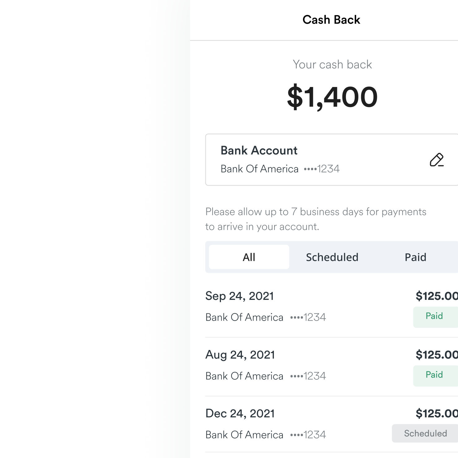
Cashback feature

Users can choose convenient cashback options and earn money just during renting apartments. On the separated page, they can add their bank account and see full payment history.

Filters and sorting

For improving search content Filters and sorting help to find content necessary content

Web app flow redesign

Goal: build a clear structure of web platform flow, design useful web interface, increase insurance sales.
Project Overview [Web]

Task for website and problems

Findy has opportunity not only to rent apartments. Web app offers affordable, comprehensive renters insurance. Users can select, purchase, change, update, claim, or cancel your policy through online portal. The problem was that users did not reach the end because of the complex flow. Improving this process was also the aim of the project. No responsive version.
Mobile-first approach

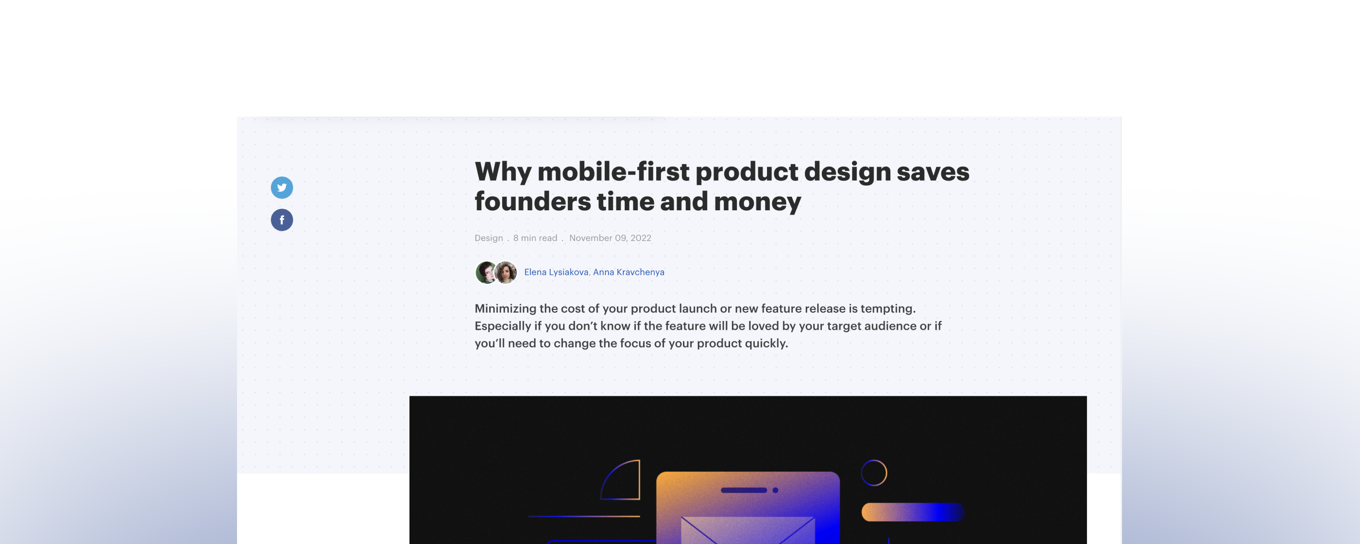
Why mobile-first product design saves founders time and money

The clients would like to change one of features on web site, but they had some budget and time limitations. Our goal was to resolve this issue.
If your product must implement new features or launch quickly without spending too much money on development, mobile-first design is the answer.  I decided to try such way to save budget on development stage.
I implemented it successfully and shared some thoughts in my article 'Why mobile-first product design saves founders time and money'. You can read it via link below.

Read my article

Competitor analysis

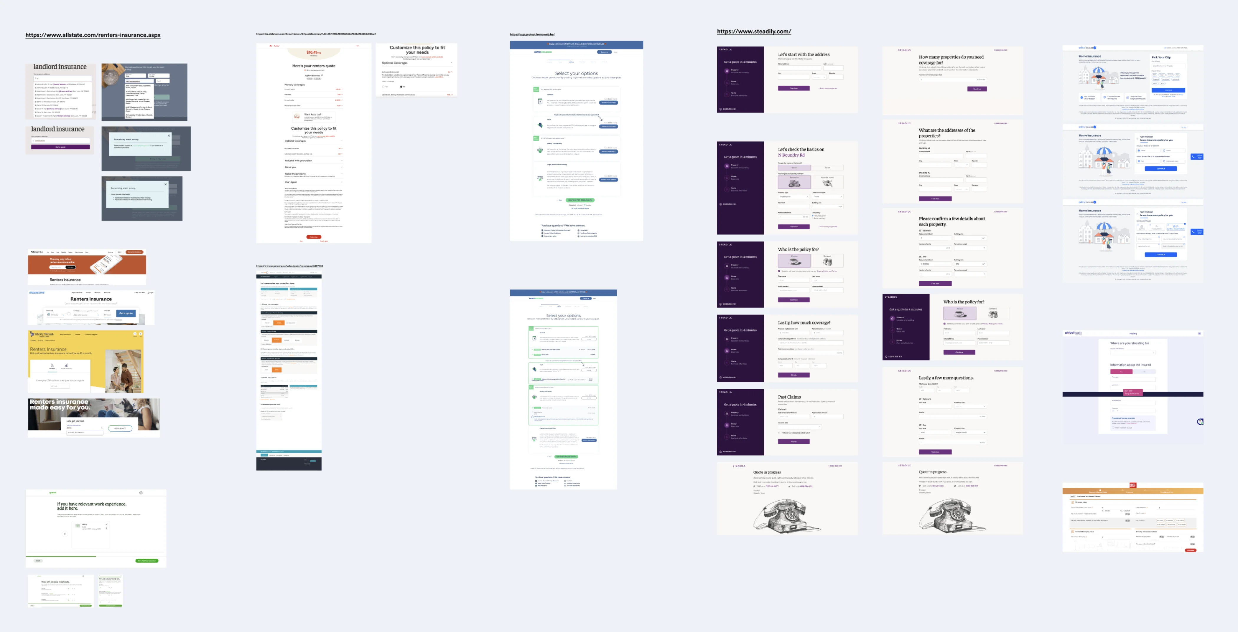
Buying insurance is a mandatory step for renting apartments in US. It includes many important items to that user should understand. Otherwise, it can cause backfire. First of all, I made competitor research to understand how to simplify the flow and how different companies provide such function.
Product design

Product design

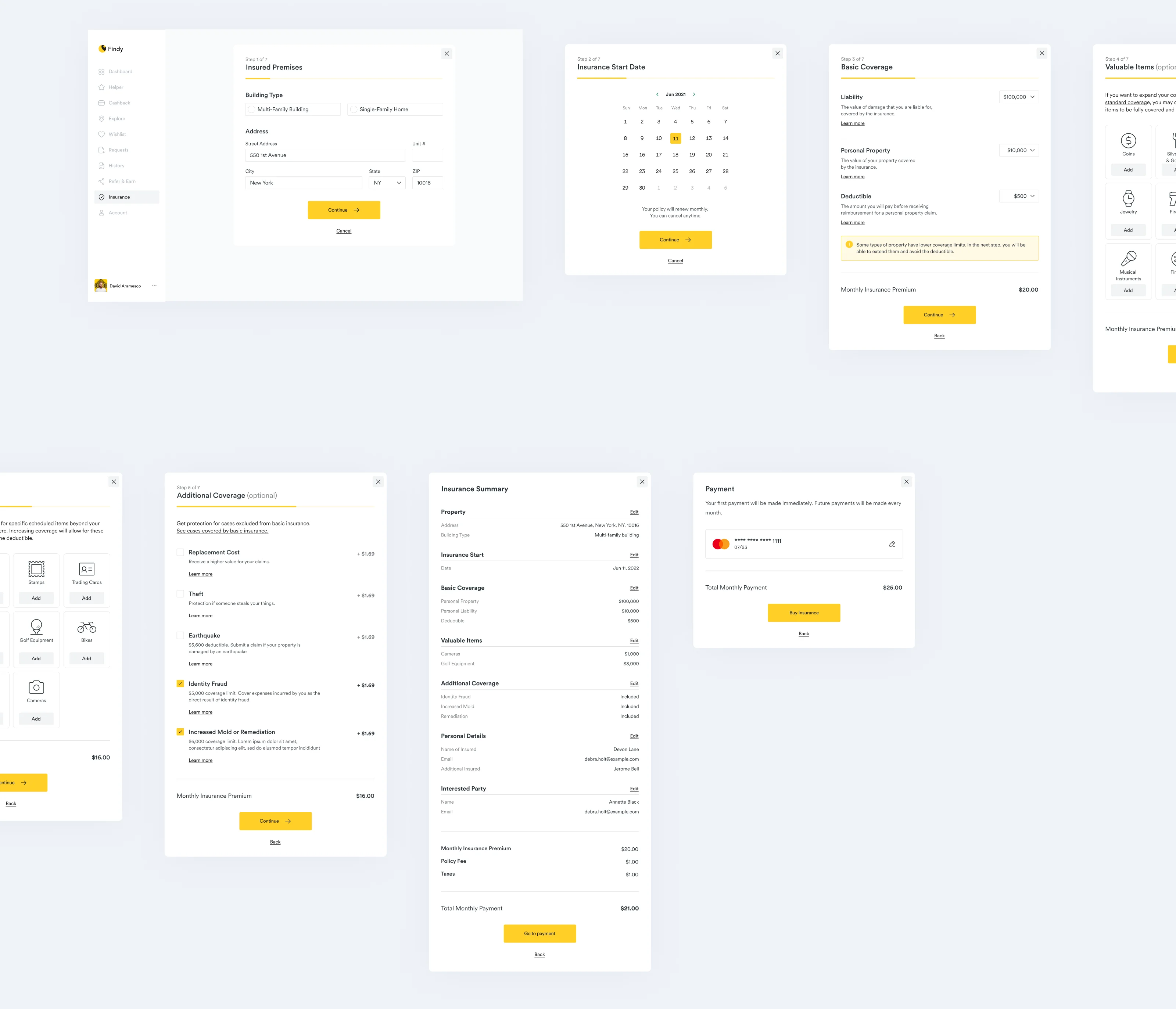
I separated all functions in other way, me and BA changed copies and made description easier, added summary and redesign payment page. We developed responsive versions. Some features’ descriptions are below.
Features

Manage insurances

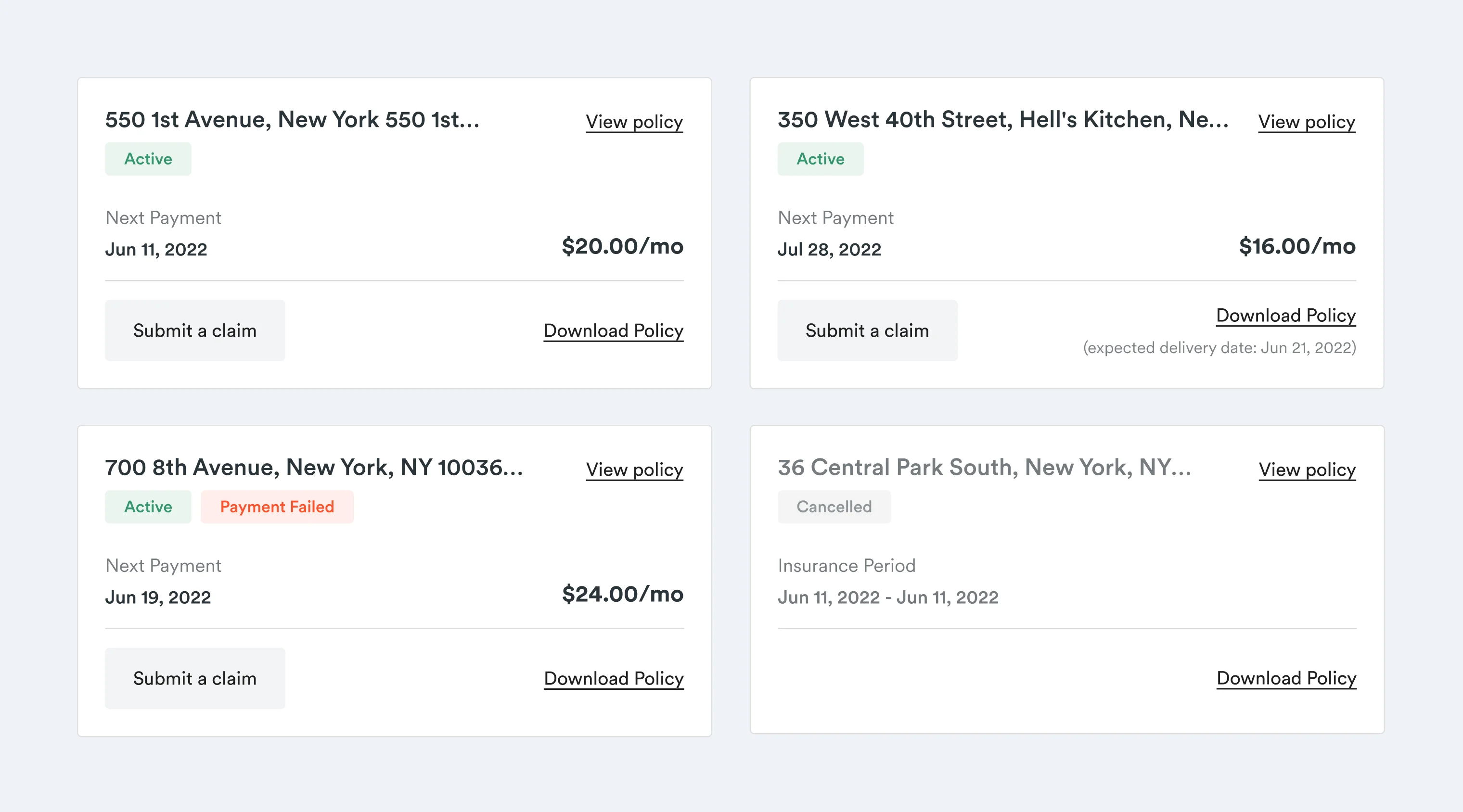
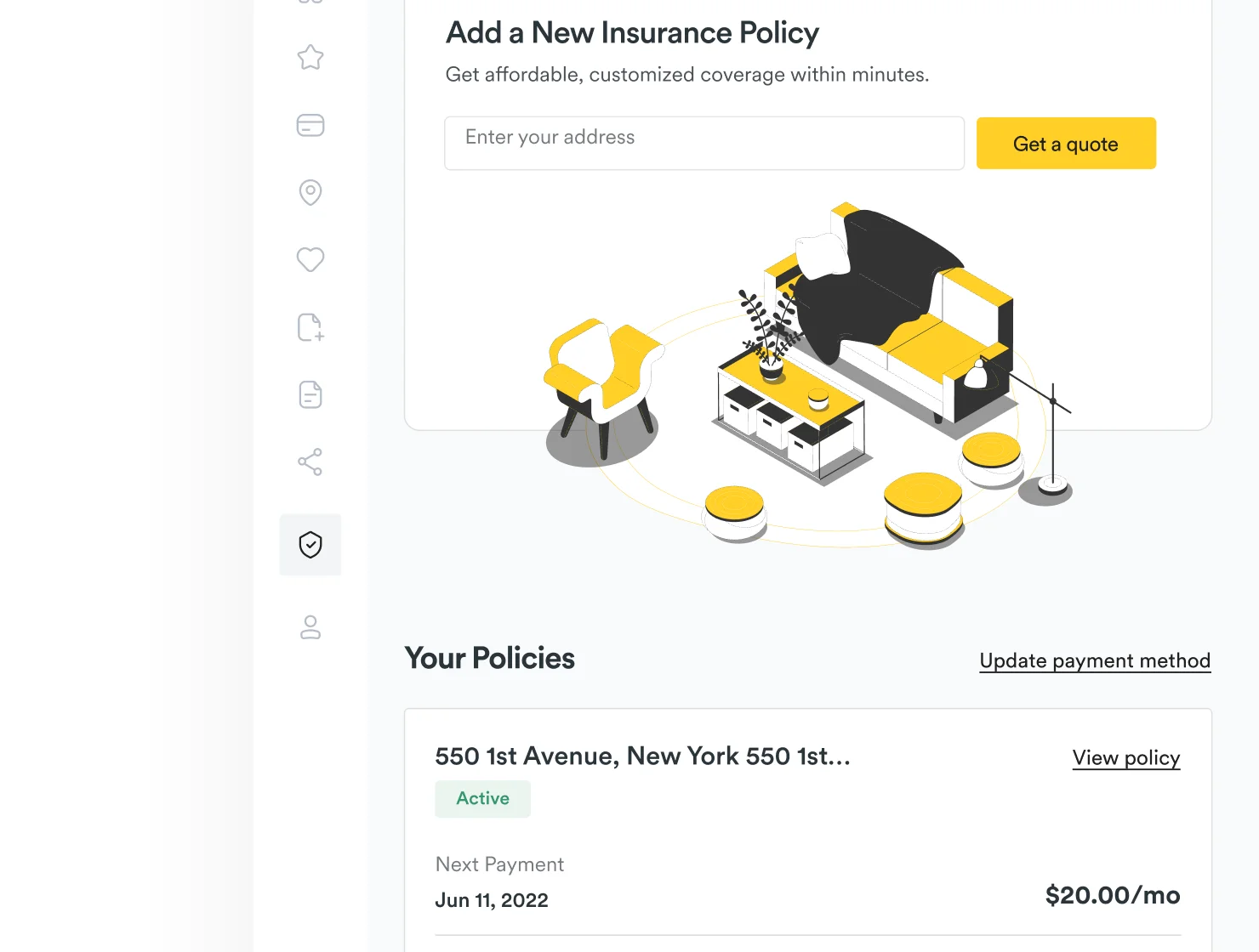
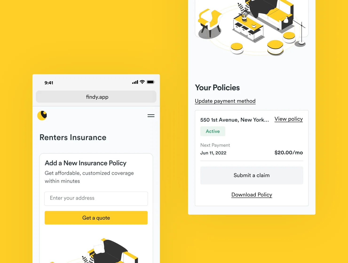
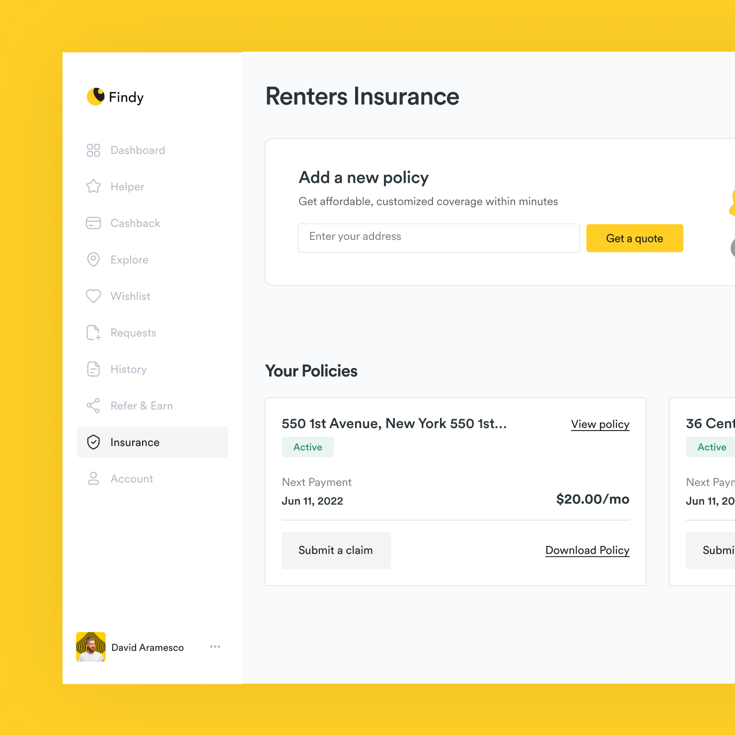
All insurance important information is visible for users. Users can select, purchase, change, update, claim, or cancel policies through main page.

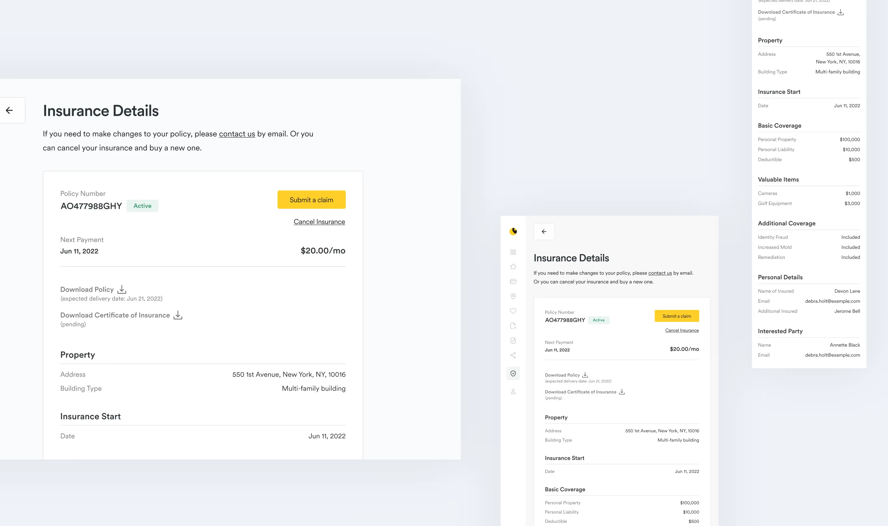
Insurance details

Does the user need to find out more information about the insurance? The user can see all the information after tapping on the card. Also, it’s possible to perform all the necessary actions on this page.

Submit a claim

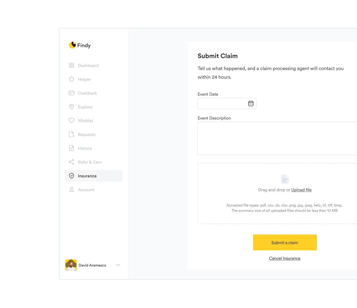
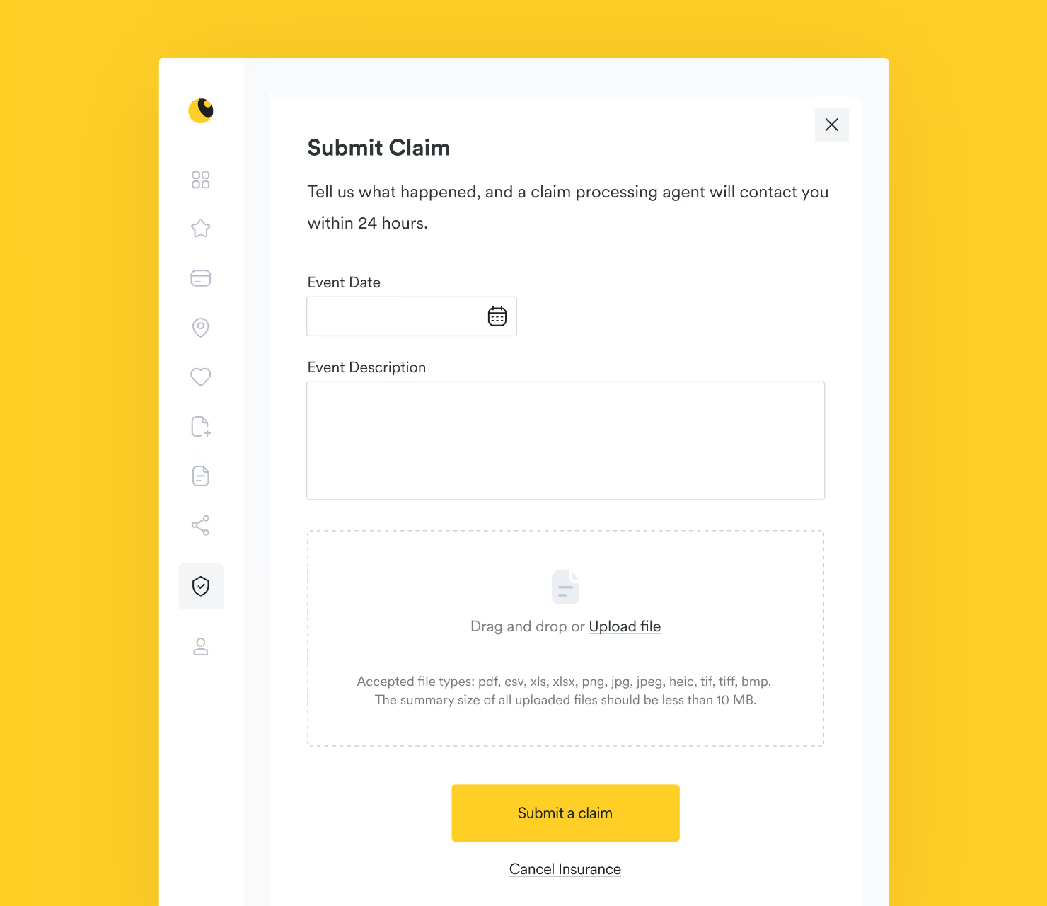
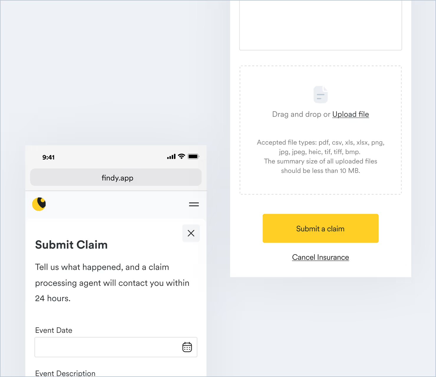
Life is very unpredictable. Sometimes the unexpected can happen. The web app allows the user to quickly submit a claim using only one button. The user just needs to fill out a small form and attach the documents.
This website is currently being updated
Some sections may be incomplete or contain minor issues. I’m working on improving it and appreciate your patience